
"Hello,
First let me say I love your blog. So many great ideas...
One area I am horrible with is putting colors together. I get so afraid to mix it up I end up doing nothing. Do you have any websites or suggestions for this issue?
Thanks bunches
Teresa"
While I did send Teresa a personal message in response to her question, I thought this would be a perfect topic for discussion here on the blog. I think that color pairing and creating harmony among various colors, deciding which colors to use and throwing it all together to create an inviting space that is pleasing to the eye can absolutely pose a challenge to even the most creative and experienced of interior designers. So naturally, it tends to be a difficulty for us amateur-status home decorators.
Many people that believe they have never had an eye for design or color, or even the least bit of a creative bone in their body, will stare at a blank slate and find themselves completely overwhelmed with all the options out there and how to properly stage the furniture in the space and make it functional to their needs. And COLOR...well, that's probably the most important and challenging aspect of them all.
So where does one start?
Well, there's a few different ways you can look at this. For me, I know that there will always be changing and evolving trends out there, and if you try to keep caught up with it all the time, you may find yourself exhausted. Or you may end up with a space that doesn't really fit the real you. I believe a space should make you feel happy when you see it, and ultimately be a reflection of your personality. So the obvious place to start should be to ask yourself, "What colors do I like?" It shouldn't matter what the color combo of the season is. You are the one that has to live with it, so make sure you love it. If you have trouble nailing down the colors you truly love, I always suggest going in and taking a look at your wardrobe. You're sure to find it there. You may also get a good idea on specific patterns that you like.
Next ask yourself, "What color pairings naturally catch my eye and arouse interest?" You may want to search for inspiration in magazines, on Pinterest or other websites to answer this question. Try to be aware of what color combinations are particularly calling out to you while perusing. And if all else fails, as an artist, I have to suggest the tried and true color wheel:
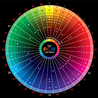
There are some very simple rules with the color wheel:
1. Opposites attract. Colors directly across from one another, or rather, complementary colors, make great pairings...however, it is a bold combo to use the same level of tone in each color. But if bold is your thing, go for it! If not, I suggest taking the opposite colors and maybe taking one or both of them and moving a couple shades paler or darker...it will still have that opposites-attract harmonious effect, but a little less abrupt, i.e. pink and lime vs. red and green.
 |
| via |
 |
| via |
2. Colors next to each other, also known as analogous colors, also mix well. I try not to pick a range of more than 2-6 in a row. It also gives you the option of having a main color and using shades in the darker and lighter directions to mix it up a bit and add visual interest.
 |
| via |
 |
| via |
 |
| via |
 |
| via |
 |
| via |
So you can see there are a lot of different directions to choose...even more than I named here. But this is a good place to start. My biggest advice is to "do you". It's not worth all the HGTV-worthiness if you are not in love with the space at the end of the day. Make sure it is functional for your lifestyle and shows off your personality...because I'm sure you have an awesome one! And do remember, that SOMETHING is better than NOTHING.
Thank you, Teresa, for your email...and thank you to all my readers! If you have any suggestions on this topic, please leave a comment below!


No comments:
Post a Comment